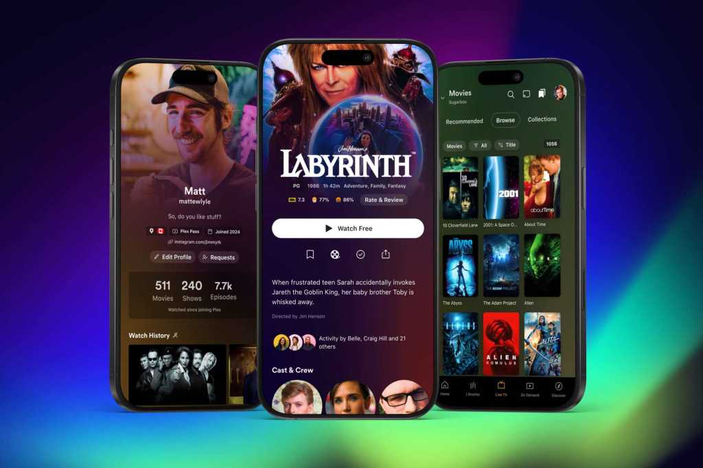

Plex is rolling out a public preview of a redesigned mobile app that makes your personal libraries far easier to reach and removes the old three-line ‘hamburger’ menu.
The most visible change is a new dedicated Libraries tab in the bottom navigation. It sits alongside Live TV, On Demand, and Discover so you can jump straight to your movies and TV shows without digging through nested menus.
To make room for that focus, Plex has removed several bottom-nav items — Trending, Activity, Find Friends, and My Profile — that previously highlighted social features. Those social tools haven’t vanished entirely; they remain accessible through the Discover tab and a simplified user menu.
Plex is also using more artwork throughout the app, showing title art for movies and shows on detail pages where available rather than just plain text.
This redesign is part of a larger plan Plex outlined in September: splitting out music playback to the Plexamp app and offering a separate Plex Photos app (currently in beta). The company says it is rebuilding its apps on a single codebase to unify development and speed up updates across platforms.
The preview is opt-in and not feature-complete yet — playlists and media casting are missing for now — but Plex intends to add those during testing. The company expects the refreshed app to exit preview by early 2025.
Author: Ben Patterson, Senior Writer, TechHive